Coordinating wall colors with furniture is one of the most important steps in defining the visual appeal of any interior space. It is the factor that determines visual harmony and highlights the beauty of details through the precise selection of the ideal color. This process is not based solely on personal taste, but also on understanding the relationship between colors, their effect on lighting, the size of the room, and the overall mood of the space.
When walls and furniture are blended intelligently, the space turns into a comfortable and balanced environment that reflects the personality of its residents. Therefore, before choosing any color, the furniture’s tone, materials, and how they interact with the backdrop must be studied carefully to achieve the best outcome.
Coordinating Wall Colors with Furniture
To achieve a visually successful coordination of wall colors with furniture, it’s essential to define the focal point on which the choices will be based, whether it’s a main furniture piece, an artwork, or a specific material within the space. After that, wall shades can be selected to support and enhance this main element without overshadowing it.
Light colors, for example, create a sense of spaciousness and highlight dark furniture, while deeper tones add a sense of luxury when combined with neutral pieces or natural wood. It is also recommended to test the color under natural and artificial lighting, as lighting can significantly change the appearance of hues. Additionally, using secondary colors in cushions, rugs, and accessories helps create complete harmony between all design elements, making the scene more balanced and pleasant to the eye.
What Does It Mean to Coordinate Wall Colors with Furniture?
Many people wonder what coordinating wall colors with furniture actually means. It refers to the process of choosing compatible color tones that work together to create visual harmony in a space, where neither dominates the other. This coordination relies on understanding color relationships and their effects on lighting, room size, and overall ambiance. Selecting the right wall color can enhance the presence of furniture pieces, highlight their materials, and create a balanced look that reflects comfort and aesthetic harmony. Coordination also includes mixing neutral and bold colors and identifying the primary elements that the walls should complement, helping transform any area into a cohesive and visually attractive environment.
Essential Principles of Furniture Color Coordination
Coordinating furniture and décor colors relies on several principles that help create complete visual harmony in any space, where colors interact with lighting, materials, and surrounding elements in a comfortable and balanced way. Understanding each piece, its role, and its presence contributes to selecting suitable tones that highlight the beauty of details and give the space a clear identity. To achieve a harmonious outcome, several key principles must be applied, as they form the foundation of the coordination process.
Key principles include:
- Defining the main color palette: choose 2–3 primary colors to create a cohesive design.
- Considering lighting conditions: lighting alters color appearance and depth.
- Balancing light and dark shades for depth and visual comfort.
- Using neutral tones as a base: they are the easiest to blend with all elements.
- Choosing a focal point, such as a standout furniture piece or artwork.
- Ensuring materials complement the color scheme: wood, fabric, metal, and glass.
Importance of Color Coordination with Furniture
Coordinating wall colors with furniture is one of the most influential factors in defining the appeal of any interior space, as it directly affects visual comfort and the overall ambiance. When colors are thoughtfully coordinated, a home becomes a comfortable, balanced environment that reflects taste and highlights details without exaggeration. Proper coordination enhances standout furniture pieces, conceals potential room flaws, and creates harmony between walls, materials, lighting, and décor elements. Choosing the right colors can also influence the perceived size of the space—light tones make small rooms appear larger, while deep shades add warmth to large areas. Therefore, color coordination is a fundamental step that cannot be overlooked when designing any home or office.
Main benefits include:
- Enhances visual harmony between décor elements.
- Provides a feeling of comfort and coherence.
- Highlights key furniture pieces.
- Improves the perception of room size.
- Creates a clear identity and atmosphere reflecting the homeowner’s personality.
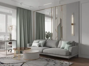
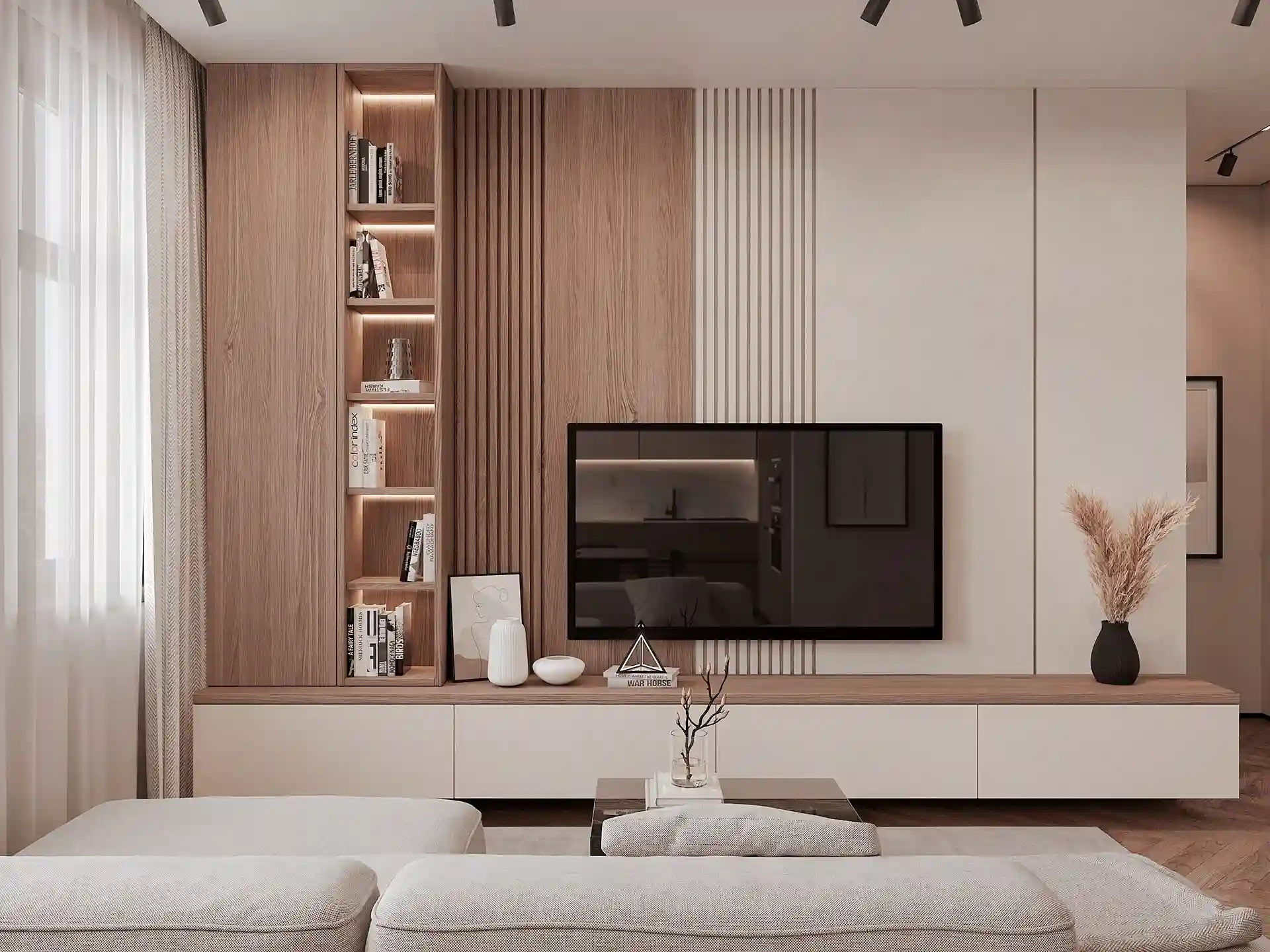
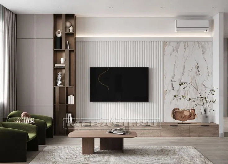
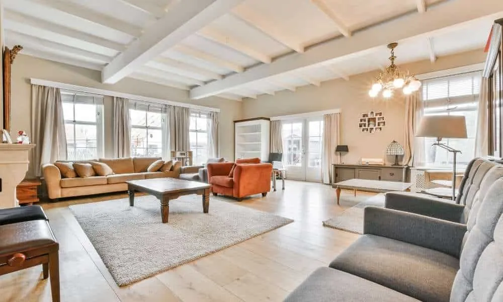
Light vs. Dark Furniture Colors
Light and dark colors play a significant role in shaping the identity and final appearance of a space. Light shades brighten small areas and reflect light, creating a sense of freshness and calm. Dark tones, on the other hand, add depth and sophistication, making them ideal for large rooms or luxurious designs. Balancing both creates clarity and elegance without overwhelming the visual field.
Popular light furniture colors:
- White: purity, spaciousness, and easy blending.
- Beige: warmth and a refined neutral base.
- Off-white: softer than white, adding a luxurious touch.
- Light gray: ideal for modern styles and balance.
Popular dark furniture colors:
- Black: elegance, strength, and enhanced geometry.
- Dark brown: classic warmth, especially in natural wood.
- Charcoal gray: modern and deep.
- Navy blue: calming and sophisticated.
CALL US NOW AND GET A QUOTE
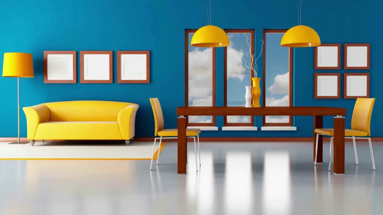
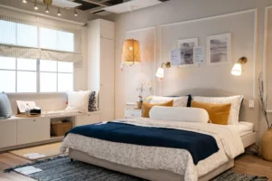
The 60-30-10 Color Rule
The 60-30-10 rule is one of the most effective and widely used methods for achieving balanced color distribution in interior design. It ensures visual harmony without complicated color decisions. The rule assigns specific percentages to each color category, helping the eye process the space comfortably and reducing visual clutter.
How the rule works:
60% – Main color:
Applied to walls, large furniture pieces, or big rugs. Usually neutral.
30% – Secondary color:
Used in medium furniture pieces like chairs or curtains.
10% – Accent color:
Appears in accessories such as cushions, artwork, and decorative items, adding vibrancy.
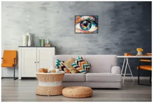
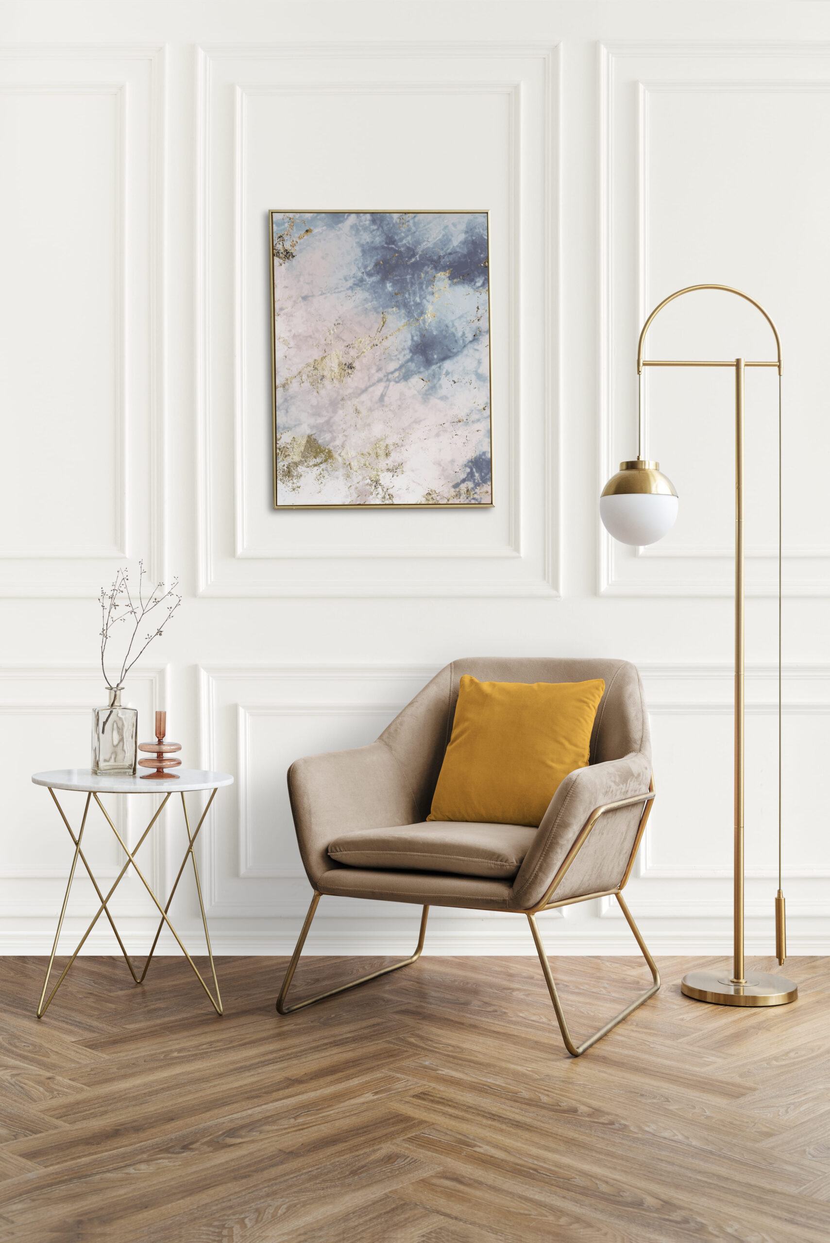
Best Colors for the 60-30-10 Rule
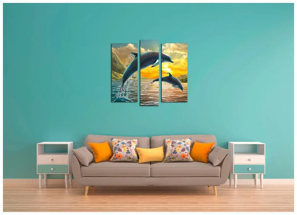
Neutral and classic tones are ideal for applying this rule, as they allow easy blending. Common choices include beige or light gray as the main color, with a deeper tone like charcoal or warm brown as the secondary shade. Vibrant accent colors such as royal blue, emerald green, mustard yellow, or burgundy add personality without overwhelming the design.
Know more about the Best Interior Design Companies
How to Choose the Right Colors for Furniture Coordination
Choosing the right colors begins with understanding the space and the desired mood—comfort, luxury, or energy. Start by defining the main color that sets the room’s tone, then select complementary shades that showcase the furniture and harmonize with the lighting and materials. Neutral colors help make bold tones easier to integrate, creating a balanced visual composition.
Steps for choosing the right colors:
- Select one main color as the design foundation.
- Choose two complementary colors from the color wheel.
- Use neutrals like white, beige, and gray to maintain balance.
- Consider natural and artificial lighting.
- Test paint samples before final selection.
- Balance light and dark tones to avoid visual heaviness.
Tips for Coordinating Furniture Colors at Home
Achieving harmony between wall and furniture colors requires a blend of personal taste and design principles. Start with a defined color palette, including main and neutral tones. Use major furniture pieces like sofas or bed frames to identify dominant colors, then enhance them with complementary tones in cushions, rugs, curtains, and accessories. Balance light and dark shades and consider the influence of lighting on color appearance. Mixing materials such as wood, fabrics, and metals also enhances color presentation and adds depth and warmth.
Common Mistakes to Avoid in Furniture Color Coordination
Many people make common mistakes when coordinating colors, leading to an unbalanced or visually unappealing space. The most notable mistake is selecting colors randomly without a defined palette, causing the room to look crowded and uncomfortable. Overusing dark colors makes a room feel smaller and heavier, while relying solely on light tones makes the space appear flat and lacking depth. Ignoring lighting effects often results in choosing colors that look different in real life. Additionally, failing to consider wall and floor colors leads to a design that feels disconnected.
Most common mistakes:
- Choosing uncoordinated colors without a unified palette.
- Excessive use of dark tones.
- Relying only on light colors with no depth.
- Ignoring the effect of lighting.
- Not considering floor and wall colors.
The Role of Lighting in Color Coordination
Lighting plays a fundamental role in enhancing wall–furniture color coordination, as it determines how colors appear on surfaces and materials. Natural light displays colors in their true form, while artificial lighting may warm or darken hues depending on the bulb type. Directional or hidden lighting can highlight certain furniture details, increasing depth or softness. Properly placed lighting results in balanced color coordination, emphasizing beauty without overwhelming the design.
FAQs About Coordinating Wall Colors with Furniture
How do you choose the best furniture color for your space?
Start by considering the room’s size and lighting. Small rooms require light colors, while dark tones suit spacious areas. Then look at the wall and floor colors to ensure harmony. Choose a main furniture piece as the base for other color decisions, and always test colors under different lighting conditions.
Should lighting be considered when choosing furniture colors?
Absolutely. Lighting dramatically affects color perception. Natural light shows true colors, while artificial light may shift tones. Therefore, furniture colors should be evaluated in multiple lighting conditions before final decisions.
What furniture color matches everything?
Neutral colors—white, beige, gray, and black—are the most versatile. They easily blend with any wall or décor color and provide flexibility when updating accessories without changing furniture.
Coordinating wall colors with furniture plays a vital role in defining the beauty and harmony of any interior space. The appeal of a room depends on how well its colors interact and reflect the homeowner’s style. With an understanding of color tones, lighting effects, and materials, anyone can achieve exceptional results. When these elements come together with a clear vision, the home becomes a unified and elegant environment where comfort and beauty coexist. Color coordination is not merely an aesthetic step—it is a way to express the identity of the space and create a long-lasting artistic impression.